Every time I do one of these posts, it is woefully short and vague. The last one was just a short list of all the new stuff that’s online. I don’t want to do that this time. I put way too much effort into figuring this out for me to just say “hey, new blog pogchamp, go bookmark it or something i guess”. Cause yeah… this took way too long to figure out.
Let’s start at the beginning:
Why do a redesign in the first place?
I actually like Jekyll a lot. It’s one of the simpler static site generators to get up and running (after you wrangle past ruby). It’s also very customizable, though I wish the plugin ecosystem was more documented.
The big problems started around the time I implemented the Chirpy theme. I wanted to expand the functionality of the site with things like the sharefeed and do some heavy visual customization in order to make the site look less like a cookie-cutter clone-template-send-tweet kinda site and more like its own thing with its own graphic design vision.
Once I started messing with that stuff, I quickly realized that Jekyll wasn’t really designed for making fancy UX, and it especially was not designed for working with bespoke data like, say, an array of links to other websites with custom descriptions.
At the end of the day, Jekyll’s web pages are still mostly made using static markup languages like HTML or Markdown. There can be dynamic functionality built out using Ruby and Liquid, but that’s more of an extension on top of the static pages. If I want to enable more dynamic content within my site, it would require libraries on top of libraries on top of ruby gem extensions on top of aaaaaaaaaaaa
Oh, and it doesn’t help that the Chirpy theme is not very friendly on mobile. I noticed two different levels of scrollbars when trying to navigate on mobile, and the responsive design is still a bit too scaled up with many elements overly padded taking up too much space. If I want to build a site ideal for both desktop and mobile, it would be more ideal to roll my own UX rather than relying on a template someone else created… and that’s not easy to do with just HTML + CSS, even with Jekyll’s built-in support for preprocessors like SASS.
At that point, what I need is less a static site generator and more…
A modern web framework
Oh god. Oh fuck. I need to learn Javascript. And React. I’m going to die.
Well, I’m not going to die, I’ve done this before in a college course about databases. And I did just fine in the end. There was just one small problem: learning React was not on the curriculum.
Our final for this course was not an exam but a group project where up to four people had to make a fake e-commerce website requiring the use of not one but two databases (we had to copy a database the professor provided into our own database that we then worked with). My group project partners decided that instead of making the website in PHP like we were taught, we needed to use “modern web frameworks” like React and Tailwind and host our database on a serverless database host like Supabase and generally make everything needlessly complicated for the sake of “this is what we oughtta do cause everyone else (in the industry, not our class) is doing it!!1!”
Of course, I had never done any of this before. So getting familiar with Javascript and React took some getting used to. I still hate the whole
boo = () => far syntax with a passion. It just looks so stupid and makes no sense to me.
We also ended up being so focused on getting our “modern web framework” to actually, well, work that we ended up missing a very obvious-in-hindsight sanity check. One of the “products” that we copied from the legacy database just had a datetime for the name. Tuns out that datetime updated every couple hours or so on the legacy database, so if we were making sure to pull from the legacy database occasionally to make sure everything was gucci, that product’s name on our database would more or less tell you the current date. We didn’t do that. So our sanity check product was way behind. The TA ended up docking some points on our project for that, and all of my project partners were super salty in the group Discord about it, calling the TA incompetent and all that jazz. I have a feeling their response had something to do with the fact that the TA was clearly South Asian…
Anyways, looking back on all that mess, I guess I can thank it for introducing me to React and Javascript. Without that foundation to build off of, doing this website rework would have taken a lot longer… though that isn’t saying much.
The group project was done in base React (using create-react-app as a starting point). That was hell. So if I was going to use React, I would want
to use a different “wrapper” framework that would make building my site a lot easier. I ended up landing on Next.js because it was one of the more
popular metaframeworks and it seemed easy enough to hop into.
My Next.js journey
This isn’t the first time I tried remaking my website with Next.js. Originally, I intended to design my website much like contemporary webapps - navbar at the top with fancy shadcn/ui hover menus, a detailed footer, a detailed account menu (I’ll get into where “accounts” come into the equation shortly), and lots of nested divs and Cards and stuff.
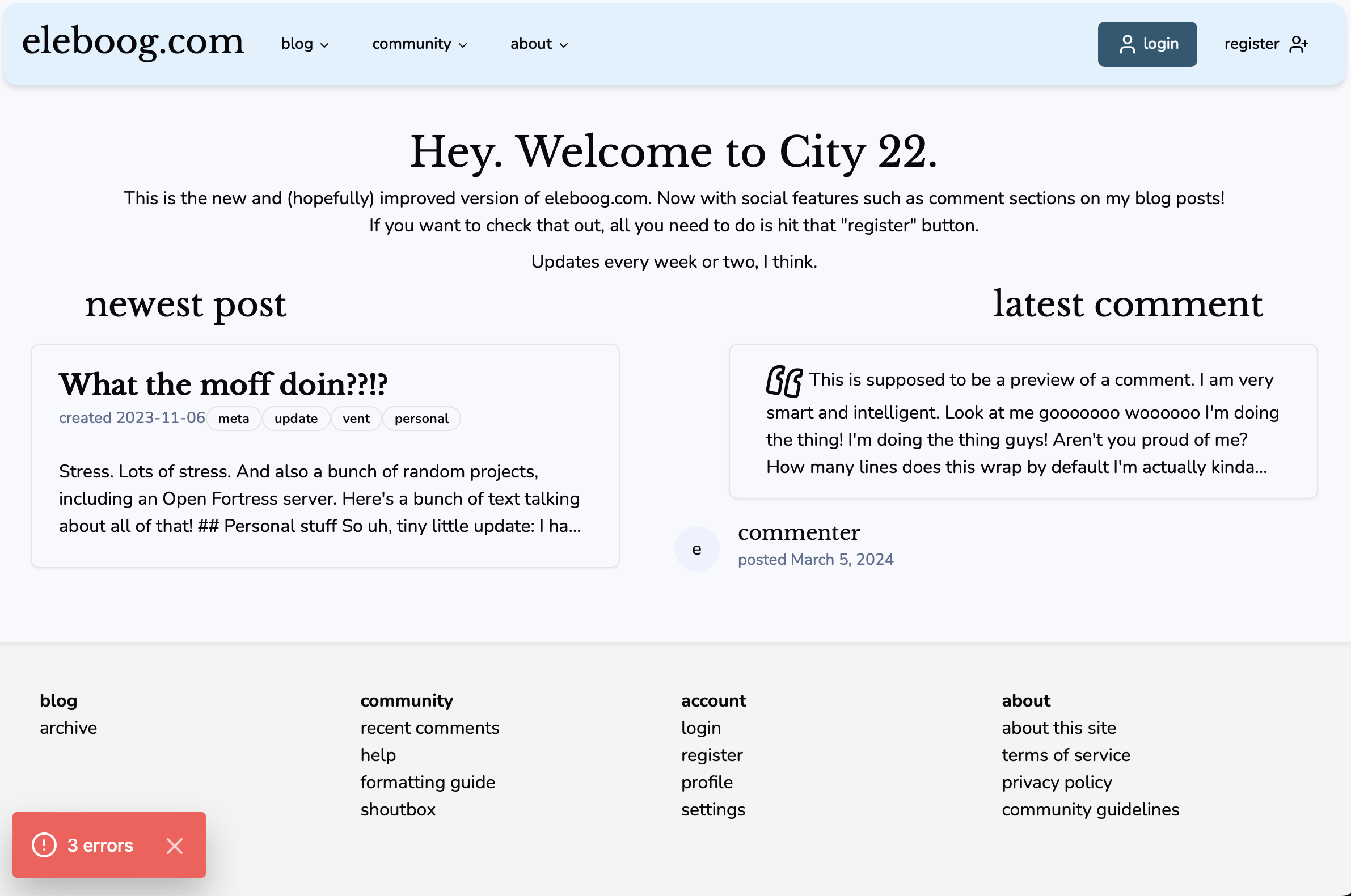
A screenshot of the original Next.js blog redesign. It showcases a navigation bar at the top of the screen designed to look like a floating bar on top of the main page, a home page featuring the newest post & latest comment, and a footer that contains the sitemap.
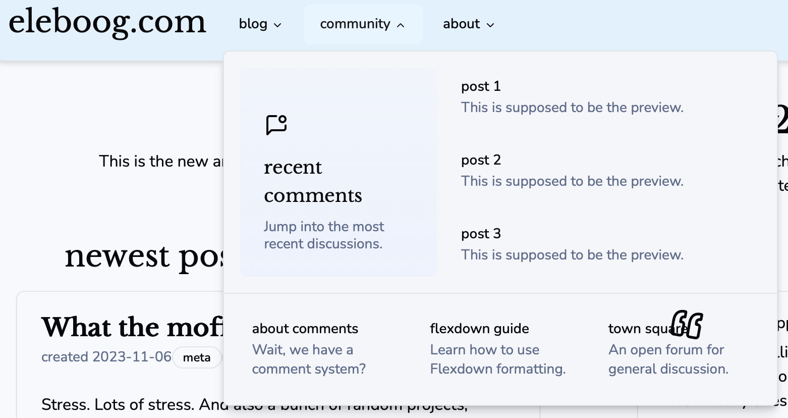
Another screenshot of the orignal Next.js blog redesign, this time showcasing the navigation bar in more detail. Hovering over one of the navbar links pops out a menu that includes links to different parts of the site. Here, a link to the three most recent comments are shown, along with links to an about page on the comment system, a guide to "Flexdown", the specific Markdown dialect I was working on, and a "town square", which would be a static page containing its own comment section for general discussions.
There were two main goals with this redesign:
-
- Design a homegrown comments system using Postgres & Auth.js. Essentially, allow visitors to make an eleboog.com account and leave comments on my blog posts.
-
- Use responsive design to make the site easy to navigate on both desktop & mobile. The main way I accomplished this is turning the sitemap into a pullout menu you can access by tapping a hamburger on the navbar.
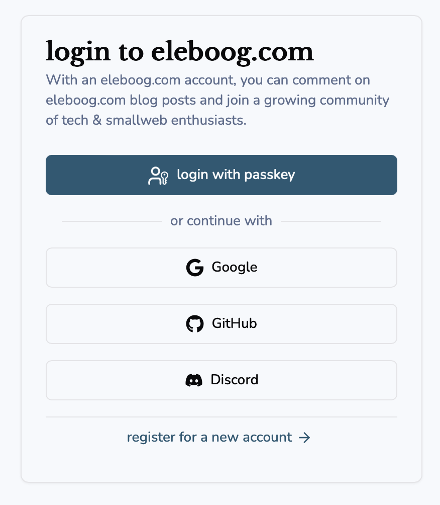
A screenshot of the original Next.js blog redesign's login dialog. The title says "login to eleboog.com", with the description reading "With an eleboog.com account, you can comment on eleboog.com blog posts and join a growing community of tech & smallweb enthusiasts." The main login button lets you log in with a passkey, but there are also single sign-on buttons for Google, GitHub, and Discord. Finally, there is a link to register a new account.
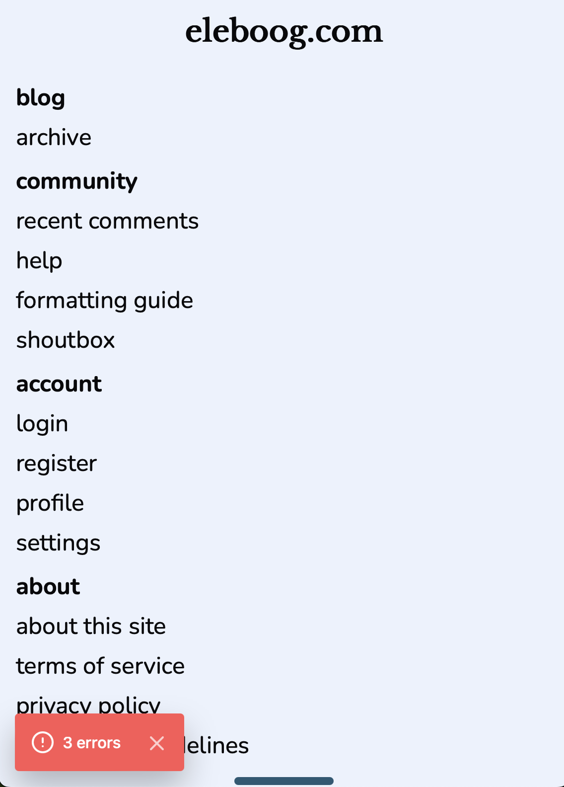
A screenshot of the original Next.js blog redesign's mobile navigation menu. It includes sections for "blog", "community", "account", and "about", mirroring the sitemap seen at the footer of the desktop site.
I ended up dropping this version of the redesign before I fully implemented the sitemap / mobile menu nor the comment system.
The big reason why was because I bit off slightly more than I could chew. In my attempt to be “trendy”, I used shadcn/ui components for a large majority of the site’s design. This worked well… until I needed to edit the components to work better for my usecases. For example, the mobile menu was created using the Drawer component, but I had to edit the component to allow for a variant that comes out from the top rather than the bottom. The fact that I could edit the component is indeed a perk of shadcn/ui, but the fact that I had to rather than that functionality already being accounted for in the original component just ended up reminding me of why I tend to shy away from WYSIWYG-style solutions: once I start bumping up against the boundaries of what the tool is capable with, my patience can run incredibly thin.
I think another reason why things fell apart was that instead of making sure I had a “minimal viable product” before expanding the project’s scope, I started work on multiple different aspects of my site at the same time, expanding my project’s scope too early. I didn’t start figuring out mobile UX until after I had started implementing the account features. I started writing a guide on “Flexdown” before I even started actually implementing it, even on the supposed “Flexdown guide” itself. I was so ambitious with what I wanted to do that even though I had been using Linear opens in a new tab to plan out the development of my project, I still ended up putting my eggs into too many baskets. I ended up perpetually halfway to Malamaroo opens in a new tab once again with seemingly no escape in sight.
Can we start over?
After a brief stint with SvelteKit (which I may make a blog post about later), I decided that the problem wasn’t Next.js but instead the way I was approaching the project.
I was chasing trends and “staple webdev libraries” without thinking about how they would benefit me first. I saw a bunch of people using shadcn/ui and ranting and raving about how cool it is, and I got swept up in the hype. I thought it would make the development process so much easier when in reality it just made things more complicated.
In a way, I fell into the same trap my group project partners did: they got swept up in doing the things the way everyone else does them, and ended up working so hard on getting those tools working that they missed crucial details staring them right in the face. I was so caught up in getting shadcn/ui and Auth.js and Neon and all that stuff working… that I forgot to put actual links in the sitemap or make the blog archive link actually go anywhere. I spread myself too thin, and the scope of everything balooned so much that it got very overwhelming very quick.
Instead, I needed to start small and work my way up to more tools as I need them. Instead of adding a new tool because I think it would help me, I need to add tools that I know will help me. I also needed to focus my work on one area of the site at a time. I needed to make sure one section was completely done before I moved on to the next (of course, nothing is ever “completely done”, but the focus here is on the feeling of being done, something I rarely get to experience because I keep hopping between different projects and never finishing what I start… like that alien from the kids show clip I linked lol).
I had to start over. And this time, I needed to do things right.
How I designed this version of the site
I was heavily inspired by the personal website & blog of Xe Iaso opens in a new tab . The minimal UX “fluff” and emphasis on text
along with a cream-colored light theme that’s easy on the eyes were the main aspects I wanted to rip off make homages to, as you may
be able to tell from the home page.
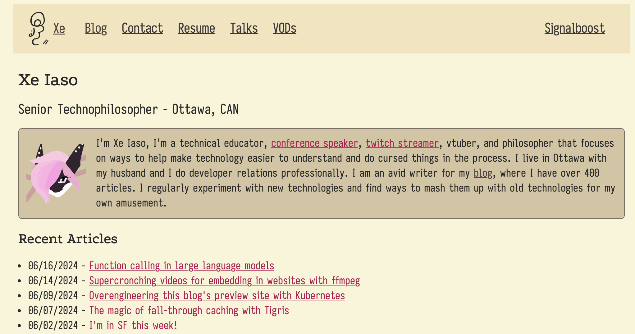
A screenshot of Xe Iaso's website. It features a simple navigation bar, their name and job title, a brief bio, and a list of recent articles. Not shown in the screenshot are lists of featured articles Xe has writen for current and past employers, featured projects, social websites Xe is also on, and a list of common tags that describe articles featured on the website.
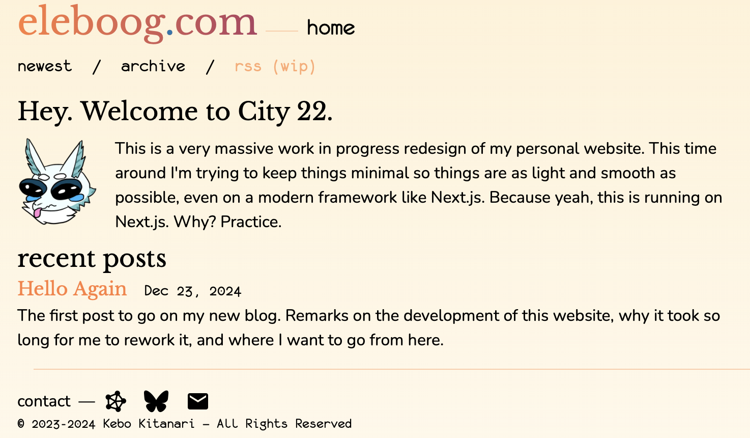
A screenshot of the current homepage of eleboog.com. It features the website title, the type of page the user is on, a simple navigation section, A brief description of the website, a list of recent posts (including this one!), and a brief section containing social links.
It’s also very much influenced by how much trouble I had wrangling shadcn/ui: while I reluctantly added it to my project to fix some CSS variable shennanigans, I’m trying very hard to minimize the usage of it. The UX style of shadcn/ui, while visually appealing, is a bit too… “samey”? Waltz into any hobbyist “webapp” developed in the past couple years and you’ll see tons of UI elements imported from shadcn/ui and slapped onto the page without much modification other than color palletes.
It’s also contradictory to the “text-first” theming I’m giving to this current vision of the site. For example, you may have already noticed a
distinct lack of buttons on this site in favor of text links. It not only makes the site easier to operate w/ screen readers & keyboard
navigation (accessibility is definitely something I want to work on for this version of the site), but it also results in less visual clutter.
This is another aspect I ripped borrowed from le orca’s website. I’m already trying to incorporate a “think smarter, not harder” philosophy
into the development of this site, so what better way to visually represent that than to make the site look like it came from both 1999 and 2099
at the same time?
Compare & Contrast
Even though the original Next.js iteration of this site didn’t last very long, it still taught me a lot, and a lot of elements of that site have been caried forward into the verison you see now.
I kept the same font selection in order to make my blog stand out from others.
I’m especially proud of using the mono font ( Monofur opens in a new tab ) in more parts of the site,
as it is my prefered terminal font.
I am also (for now) using MDX to power my blog posts, but instead of wrangling next/mdx, I decided to try Contentlayer… and I’m very impressed!
It made implementing and extending MDX very easy, and I would definitely recommend it for anyone wanting to make a similar site to mine.
There are, however, a couple of key differences. First of all, right now I’m focusing squarely on getting my blog exactly where I want it to be, including the amount of content available, before I start developing the other systems of the site, such as the comment and account systems. I want to actually, ya know, write stuff more often this time, and the perpetual busywork of adding new features to my blog directly contributes to me not writing jack shit for the blog itself. I also want to make sure the formatting of my blog and the accessibility of my content is at a good place before I throw two brand-new full-stack systems into the mix. Accessibility is something I suspect was lacking in the earlier form of this blog, so I want to focus on making sure the blog is fully accessible through screen readers and keyboard navigation.
Where to go from here
Right now, the focus is on making sure the base features are in order and that I’m actually writing instead of constantly working on new features that don’t matter. So, until I have at least two to five additional articles published on this website, I will soely work on maintaining and improving the existing functionality of this website. This includes the MDX rendering, overall site performance & responsiveness, UX tweaks, etc.
After I feel like I’m ready, I want to start delivering new features that are either supplemental to my blog or allow me to add more things to my articles.
The following is a list of planned features, starting with…
Sharefeed 2.0
Last time on Dragon Ball Z, I introduced a “sharefeed”, essentially a collection of links to other websites that I thought were interesting. It had its own RSS feed so, if you wanted, you could subscribe to it and get a currated collection of random shit in your Feedly or whatever.
My main problems with the sharefeed were how rarely I updated it (of course) and how exactly it was implemented. The Chirpy theme for Jekyll had functionality built in to generate an RSS feed along with the rest of the site. It was basically a whole bunch of Liquid magic. To create the sharefeed, I duplicated this functionality and tweaked it to instead work with a YAML array of bespoke data I crafted myself. I also duped the functionality that powered the home page listing of posts, card formatting and all, to power the sharefeed’s page on my site. It worked! But it always felt slightly hacky. Jekyll is definitely not designed for stuff like this, and implementing the sharefeed just reinforced how hard it is to get Jekyll to do exactly what you want.
Now that I’m using an actual fullstack framework, I think it’s time to give the sharefeed another shot. This time, I’ll be using JSON to format the data instead of YAML since there are better tools for handling JSON in JS/TS (it’s almost like JavaScript is in the freakin’ name). This will make it much easier to display the sharefeed on the website as well as build a RSS feed off of it.
One detail I want to fix with this version of the sharefeed, though, is related to the RSS feed. I want to allow people to subscribe to one feed for all of my content instead of having to subscribe to multiple feeds. So while my blog posts and the sharefeed will each get their own separate feeds, there will also be one shared RSS feed that contains all of the “feedable” content I post on the site. There’s one more feed that will eventually be incorporated into this as well, but that warrants more explanation…
Embedded media
One thing I didn’t really do too much on Jekyll was embed content within my articles. The most I ever did was static images. I want to change that.
Now that I am working with MDX, implementing embedded media is as simple as creating a new component for that embed, then adding that component into
the list of mdxComponents available to me. After that, all I need to do is just call it with something like <YouTube v="fjasljfkj" t="253"/> and boom,
I got a YouTube video embedded in my article. It isn’t the most elegant looking solution, but its implementation is so smooth that I’m not too
nitpicky about it anymore.
The main use for embedded media that I’m excited about, though, is embedding audio through an audio player. Why?

A variation of the SpongeBob "Imagination" meme: the titular sponge bob is sitting in a cardboard box, spreading his hands out wide, drawing a (fake) rainbow between them, and exclaiming "Imagination!" ...But this time, instead of "Imagination", it's "PODCASTS".
Okay, maybe not podcasts necessarily, but close. Basically, one problem I see with screen reading my articles is that if I include visual elements like images, the only description you can get of them is whatever I can fit inside the alt text (which, if you may have noticed, pulls double duty as the image caption… at least for now). You also probably know of the struggles of conveying tone through text. I try to do that with fancy formatting techniques, but obviously if you can’t see the text, you can’t see whether that text is bold or italic or whatever. This isn’t just an accessibility issue: what if you’re out on a walk and want to catch up with something I wrote without having to stare at your phone the entire time? You can’t easily just put it on in the background and listen to it like you can a YouTube video.
But you know what YouTube videos have? People talking. What if… get this… I talked?
Something I want to start doing with my blog posts, especially longer ones (like this one lol) is providing “narrated” versions that you can listen to either on the website itself or through an RSS feed. Once the narration is available, all you need to do is click or tap on an embedded audio player at the top of the page and my lovely voice will start reading the article out loud to you. I will try to convey the tone that may be hard to convey over text, describe any visual elements such as images with more detail than I may put in the alt tags, and generally provide a quality, enjoyable, and (most importantly) fun narration.
It would also be a good idea to put these narrated articles up on their own RSS feed. Of course, they will also be a part of the “main” feed along with my text posts and sharefeed, but I want to give it its own RSS feed for one specific purpose: podcast players. Many podcasts are delivered in the form of an RSS feed, so in turn many podcast players allow users to import RSS feeds into the app to subscribe to a podcast directly without having to go through third-party platforms like Apple Podcasts, Spotify, etc.
If I make an RSS feed for my narrated articles, you could subscribe to it on, say, your iOS Podcasts app, or any other podcasts app that you choose. Not only will you get notified when a new narrated article is out, but you’ll also be able to listen to it through the app, either right there and then or whenever the hell you want. On top of that, if I do publish my narrated articles through Apple Podcasts, Spotify, etc., it will mean that content is now officially part of a content recommendation algorithm. Somebody can stumble across my dumb bullshit ramblings just by the will of the ghost of Steve Jobs. Woa.
This whole concept is really cool to me, and I really want to try to get it implemented. Once I do, I’ll be sure to write up an article about it. I’ll also make sure that the narrated version of that article is published at the exact same time as the text version, so you can hear me talk about the system as you are using it. Wild stuff.
The journal, or “shittenings”
Before I wrap things up, I briefly want to touch on my half-baked attempt at a “HTML Journal” opens in a new tab , a page I called “shittenings”. It was essentially a single page where I would occassionally post small updates on what I was working on. I really like the concept of it, but I’m not sure whether to make it again or try to transition over to social media like fedi, bluesky, cohost, etc. If I do implement it, I’d want to make a habit of updating it every week even if I don’t post a full article. I may even put it on its own RSS feed or mix it with audio rambles that would also be posted on my “podcast” RSS feed. I don’t know for sure.
And now, for something completely different…
A reflection
Usually, whenever I get to the end of a blog post, I’m not really sure how to end it. Most of the time they’re just a stream of consciousness, a loosely linked list of thoughts and ideas and concepts and opinions that just go on and on until I run out of things to say… and it’s not like you can tie rabbit holes up in a neat little bow unless you’re a god or something.
To be fair, this particular post still falls under that general template. I didn’t know exactly what I wanted to write going into this. I just knew I didn’t want this to be as short as most of my other blog posts, and I wanted to give some idea as to how the hell I got here (for prosperity!).
You can probably tell I’m getting tired and out of my element. It’s taking me a bit too much of my being to not end this on one of those zingers like I usually do.
But I don’t want to blog like I usually do anymore. I want to blog like someone who actually has stuff to say. Sure, I still want to be relatively casual with what I talk about (I’m certainly not an expert in much of anything right now), but I want what I put out there to be meaningful and substantial. I don’t think I’ll ever get to Professional™ YouTube® Video™ Essayist™ levels of “substantial”… but checking the word count I’ve got in this thing so far, around 2500 words is way more than I ever imagined I’d put out for a first post.
The problem is that specific desire to be “meaningful” and “substantial” in what I have to say… is one of the meanest and toughest obstacles between me and actually saying anything at all.
There’s a reason why “Updates once or twice a week I guess” has become my version of “YGS Every Friday” opens in a new tab : to post an update is to have something I want to talk about. When I have something I want to talk about, I need to be able to talk about it in a way that feels “meaningful” and “substantial”. Of course, I also need to actually finish what I start, which as I have already established is close to impossible on a good day. I may start on a good idea, but as I whittle away at that idea, I almost instantly get discouraged. I inevitably come towards a “Now what?” moment that puts a dampener on the whole thing. So I put it down. And then I never pick it back up.
Still… once in a while… I start something. And then I keep going. And going. And going. Never letting off the gas. Because I know in the back of my mind as soon as I let go, the spark is lost. So surely… eventually… through hours and hours of hyperfocus… I actually finish what I start.
At first, I thought this post was one of those moments. I started working on this post in the morning. It is now 11:11PM. I worked on this. The. Entire. Day.
But I can’t do that every day, let alone “once or twice a week”. I need to find a way to motivate myself to actually finish the articles I write. And I think through writing this, I finally figured out how.
I don’t need to be “meaningful” or “substantial”. The fact that I started this article means that the idea is already meaningful enough to me to be worth exploring.
When I inevitably get to a “Now what?” moment, I don’t have to push through no matter what. I can allow myself to put it down. I can allow myself to rest. It’s how this article got made. When I felt like my wheels were spinning fruitlessly, I stood up. I made myself food. I joined a voice chat and listened to people talk. I listened to good music. I did something to refresh my mind, and suddenly it became a lot easier to pick up the article again and start writing from where I left off. It’s also how this website got made. When what I was doing wasn’t working, I put it down, let it sit there for a while, then came back to it with fresh eyes.
What you’re seeing is the result of allowing myself to rest. When you find meaning through rest, the substance isn’t that hard to find. The motivation and meaning come from your ability to step back and regroup, and the substance comes from letting your brain cool off before working it again.
I don’t need to seek meaning or substance. I don’t need to persue it, afraid if I let go that it will float away, never to be seen again. Once I sit down for a second to live a little, the magic finds me.
…It’s almost like that’s how you deal with ADHD or something. Wild.
Thanks for reading. Here’s an album suggestion as a gift for sitting down yourself. opens in a new tab See ya in a week or two.